Loading...
Building Better Angular Components Through Augmentation
Introduction
One of the most powerful yet underutilized patterns when building modern Angular applications is element augmentation. Instead of creating completely custom components that wrap up native HTML elements, we can enhance existing elements to create more maintainable, accessible, and performant applications.
Understanding Element Augmentation
Element augmentation is the best practice of extending native HTML elements with additional functionality while preserving their inherent behaviours and accessibility features. This approach offers several advantages:
- Preserved accessibility: Native elements come with built-in ARIA attributes and keyboard navigation.
- Better performance: Less DOM nesting and fewer components to manage.
- Familiar API: Developers can use standard HTML attributes and events.
- Better control: User have direct access to native element properties and events.
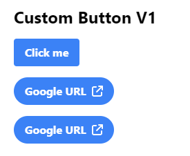
Let's create a custom button component:
we will create a button to display text and icon, It also can behave as button and link. It has some common @Input properties.
@Component({
  selector: 'custom-button-v1',
  templateUrl: './custom-button-v1.component.html',
  standalone: true,
  imports: [CommonModule, FontAwesomeModule],
})
export class CustomButtonV1Component {
  @Input() buttonText!: string;
  @Input() buttonContent!: TemplateRef<any>;
  @Input() buttonMode: ButtonMode = 'button';
  @Input() icon!: IconDefinition;
  @Input() url!: string;
  @Input() buttonType: ButtonType = 'simple';
  @Input() disabled: boolean = false;

  //...
}
 <custom-button-v1 [buttonText]="'Click me'" [buttonMode]="'button'"></custom-button-v1>
 <custom-button-v1 [buttonText]="'Google URL'" [icon]="faExternalLink" buttonType="pill" 	     [buttonMode]="'externalLink'" [url]="'https://www.google.com'"></custom-button-v1>
 <custom-button-v1 buttonType="pill" [buttonContent]="buttonContent" [buttonMode]="'externalLink'" [url]="'https://www.google.com'">
 </custom-button-v1>

 <ng-template #buttonContent>
  <div class="flex items-center gap-2">
    <span>Google URL</span>
    <fa-icon [icon]="faExternalLink"></fa-icon>
  </div>
</ng-template>
Here's the result:
However with this approach, there are always constraints and drawbacks:
- We only have icon option that is FontAwesome.
- Text and Icon position.
- The button is wrapped by another element so that whenever we need to add an attributes, we have to write a new input.
Try to make a better way:
In the Angular accessibility guide's section, the recommended approach is to enhance existing HTML elements rather than creating custom ones from scratch. Native HTML elements come with built-in accessibility features, keyboard support, and established semantics. By building upon these native elements, you maintain their inherent accessibility benefits while adding your desired functionality.
Let's create a updated one:
- Selector: Instead of using a custom element selector (like <custom-button>), we use attribute selectors on specific elements (button[custom-button-v2] and a[custom-button-v2]).
- Content projection: we use pure one which allows us to place any between element tags.
- Styles: Instead of wrapping elements in additional divs or applying classes through template markup, we use @HostBinding to apply CSS classes directly to the host element.
@Component({
selector: 'button[custom-button-v2], a[custom-button-v2]',
standalone: true,
imports: [CommonModule],
template: '<ng-content></ng-content>',
})
export class CustomButtonV2Component {
@Input() buttonType: ButtonType = 'simple';
@Input() disabled: boolean = false;
@HostBinding('class.opacity-50')
@HostBinding('class.cursor-not-allowed')
get disabledClass() {
return this.disabled;
}
@HostBinding('class') get buttonTypeClass() {
switch (this.buttonType) {
case 'simple':
return 'bg-blue-500 hover:bg-blue-700 text-white font-bold py-2 px-4 rounded';
case 'pill':
return 'bg-blue-500 hover:bg-blue-700 text-white font-bold py-2 px-4 rounded-full';
case '3D':
return 'bg-blue-500 hover:bg-blue-400 text-white font-bold py-2 px-4 border-b-4 border-blue-700 hover:border-blue-500 rounded';
}
}
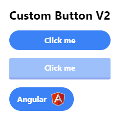
}Now we can use custom button more flexibility:
<button custom-button-v2 buttonType="pill">Click me</button>
<button custom-button-v2 buttonType="3D" [disabled]="true">Click me</button>
  <a target="_blank" href="https://www.angular.dev" class="flex items-center gap-2 w-fit" custom-button-v2 buttonType="pill">
    <span>Angular</span>
    <angular-icon></angular-icon>
  </a>
The result after updating:
Conclusion
Augmenting native elements through directives and container components is a powerful pattern that maintains accessibility, provides familiar APIs, and allows for flexible customization. As recommended by the Angular Accessibility, this approach should be preferred over creating completely custom elements whenever possible.
References
- NGROME MMXXII - Design better Angular components with those principles
- How to control native HTML elements with Angular